Data Visualization Tools for Digital Marketers
In today’s data-driven world, digital marketers must effectively communicate insights derived from data.
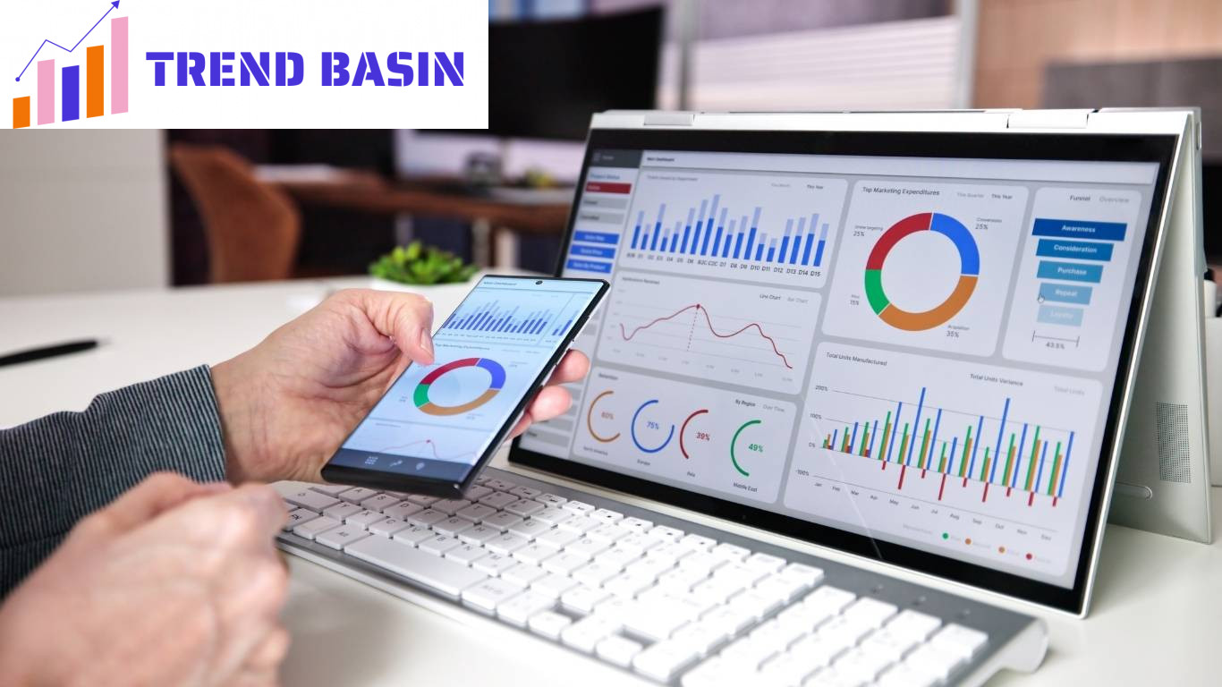
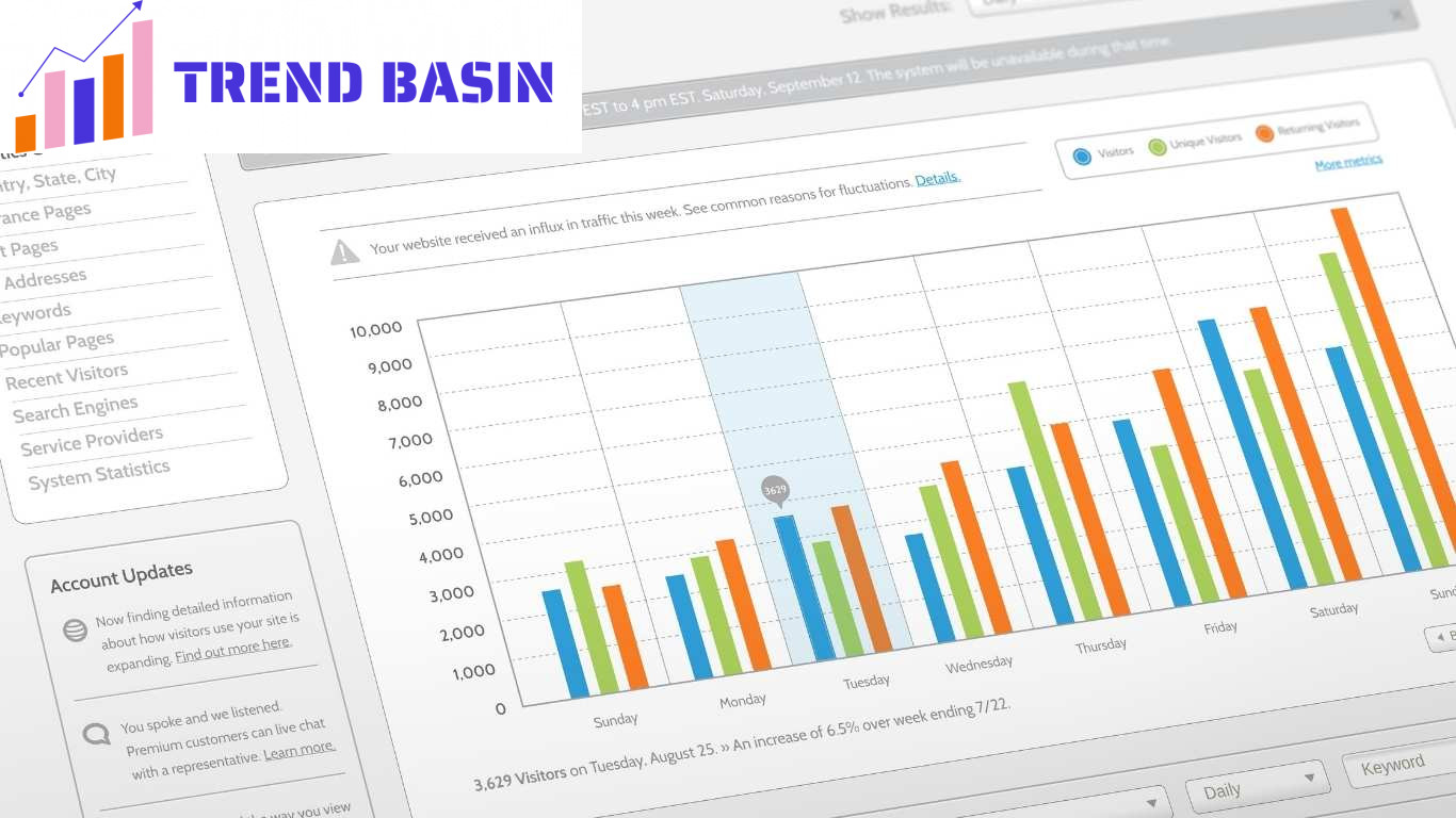
Data visualization tools enable marketers to present complex data in a visual format that is easy to understand.
This article explores the various data visualization tools available to digital marketers and how they can enhance marketing strategies.
At Trend Basin, we understand the importance of leveraging data visualization to improve your marketing efforts. In this article, we will delve into the top data visualization tools, their features, pros and cons, and real-world applications.
Key Takeaways
Data visualization tools play a crucial role in helping digital marketers make informed decisions. By transforming complex data into visual formats, these tools enhance communication, improve efficiency, and increase engagement.
What are Data Visualization Tools?
Data visualization tools are software applications that allow users to create visual representations of data. These tools can transform raw data into graphs, charts, dashboards, and other visual formats.
By making data more accessible and understandable, marketers can make informed decisions, identify trends, and communicate insights more effectively.
Benefits of Data Visualization in Digital Marketing
Data visualization offers numerous benefits for digital marketers, including:
- Improved Decision Making: Visualizations help marketers quickly identify patterns and trends, allowing for faster and more informed decision-making.
- Enhanced Communication: Visual data is easier to understand and share with stakeholders, leading to better collaboration.
- Time Efficiency: Visualizing data can save time compared to analyzing raw data, enabling marketers to focus on strategy and execution.
- Increased Engagement: Engaging visuals can capture the audience’s attention, making presentations and reports more impactful.
Top Data Visualization Tools for Digital Marketers
There are many data visualization tools available, each with unique features and capabilities. Here are some of the top tools to consider:
1. Tableau
Overview: Tableau is a leading data visualization tool that allows users to create interactive and shareable dashboards. Its user-friendly interface makes it accessible to marketers with varying levels of technical expertise.
Pros:
- Intuitive drag-and-drop interface
- Supports various data sources
- Offers advanced analytical capabilities
Cons:
- Can be expensive for small businesses
- Steep learning curve for advanced features
2. Google Data Studio
Overview: Google Data Studio is a free tool that allows users to create customizable dashboards and reports. It integrates seamlessly with other Google products, making it an excellent choice for marketers already using Google Analytics and Ads.
Pros:
- Free to use
- User-friendly interface
- Real-time data updates
Cons:
- Limited customization options compared to paid tools
- Performance can lag with large datasets
3. Microsoft Power BI
Overview: Power BI is a business analytics tool that provides interactive visualizations and business intelligence capabilities. It is suitable for marketers looking for an affordable option with robust reporting features.
Pros:
- Affordable pricing
- Integration with Microsoft products
- Strong data modeling capabilities
Cons:
- Less intuitive than some competitors
- Limited support for non-Microsoft data sources
4. Datawrapper
Overview: Datawrapper is an online tool designed for journalists and marketers to create simple and effective visualizations. It is particularly useful for creating charts and maps quickly.
Pros:
- Easy to use
- No coding required
- Responsive design for mobile viewing
Cons:
- Limited customization options
- Not suitable for complex data analysis
5. Infogram
Overview: Infogram is a user-friendly tool for creating infographics and interactive visualizations. It is ideal for marketers looking to create visually appealing content for social media and blogs.
Pros:
- Wide range of templates
- Easy to share and embed visuals
- Collaborative features for teams
Cons:
- Limited free version features
- Some templates may feel generic
Further Analysis: Real-World Applications of Data Visualization Tools
Data visualization tools have proven essential in numerous successful marketing campaigns.
Below are some notable case studies that illustrate how businesses have leveraged these tools to achieve remarkable results.
1. HubSpot: Analyzing Marketing Performance
HubSpot, a leading marketing and sales software company, used Google Data Studio to analyze the performance of their various marketing campaigns.
By visualizing data from different sources, such as social media engagement and email marketing performance, they could quickly identify trends and make data-driven adjustments to their strategies.
By regularly updating their dashboards, HubSpot was able to track key performance indicators (KPIs) in real-time.
This allowed them to pivot their strategies based on performance data. As a result, they achieved a 20% increase in overall engagement across their campaigns, demonstrating the effectiveness of real-time data visualization in optimizing marketing efforts.
2. Netflix: Viewer Engagement Insights
Netflix utilizes advanced data visualization tools to analyze viewer engagement and preferences.
By visualizing subscriber data, including viewing habits and ratings, they gain insights into what types of content resonate with their audience.
This data-driven approach helps Netflix make informed decisions on content creation and curation.
For example, when launching a new series, Netflix can analyze similar content’s viewership data to predict success.
This strategy allowed them to develop targeted marketing campaigns, resulting in a significant increase in viewership for new releases.
Their data visualization tools have enabled Netflix to reduce the risk of content failures and improve overall customer satisfaction.
3. Spotify: Personalized Listening Experience
Spotify employs data visualization techniques to enhance user experience through personalized recommendations.
By analyzing user listening habits, playlist creations, and feedback, Spotify visualizes this data to offer tailored music suggestions to users. The result is a more engaging and personalized listening experience.
For instance, their “Discover Weekly” playlist is generated based on the user’s past listening behavior and preferences. This feature has significantly increased user engagement and retention rates.
By visualizing user data effectively, Spotify keeps its users engaged, leading to a 30% increase in weekly user activity.
4. Walmart: Supply Chain Management
Walmart employs advanced data visualization tools to optimize its supply chain management.
By visualizing data related to inventory levels, sales trends, and customer behavior, Walmart can streamline its operations and reduce costs.
The company uses Tableau to create interactive dashboards that provide insights into stock levels across different locations.
For example, if a particular product is selling well in one region, Walmart can quickly adjust inventory levels in other areas based on this data.
This responsive approach has led to a significant reduction in stockouts and overstocks, ultimately saving the company millions in operational costs.
5. Unilever: Consumer Insights for Product Development
Unilever has utilized Power BI to analyze consumer insights and market trends. By visualizing data from various sources, including market research and social media sentiment, Unilever can identify emerging trends and consumer preferences.
This data-driven approach has allowed Unilever to innovate and tailor products to meet consumer demands.
One notable example is their “Love Beauty and Planet” campaign, where Unilever used data visualization to gauge consumer interest in sustainability.
By analyzing social media conversations and market data, they developed a product line that resonated with environmentally conscious consumers.
This campaign resulted in a successful product launch and increased brand loyalty among younger demographics.
6. The New York Times: Enhancing Journalism with Data Visualization
The New York Times has gained recognition for its innovative use of data visualization in journalism. They have employed tools like Datawrapper to create compelling visual stories that accompany their articles.
This approach not only engages readers but also helps them understand complex topics more clearly.
For example, during the COVID-19 pandemic, The New York Times used data visualization to track case numbers and vaccination rates.
By presenting this data in an accessible format, they effectively informed the public and provided insights into the pandemic’s progression. This ability to visualize critical information has solidified their position as a trusted news source.
Conclusion
Incorporating data visualization tools into your marketing strategy can provide valuable insights and improve decision-making.
By understanding and utilizing these tools, marketers can effectively communicate their findings and drive better results.
For more insights on digital marketing trends and tools, stay connected with Trend Basin.
Follow us on LinkedIn and Facebook to stay updated!


